Curious to know which colours are going to be big in 2026? We’ve rounded up the latest paint launches.
Although Pantone has announced its highly-anticipated Colour of the Year to be Cloud Dancer (a calm, off-white), 2026 is predicted to be filled with gorgeous, irresistible hues – picture captivating blues, bold reds, and pumpkin spice latte shades.
So, if you are planning a home improvement project and need some paint inspiration, read on to discover the latest launches…
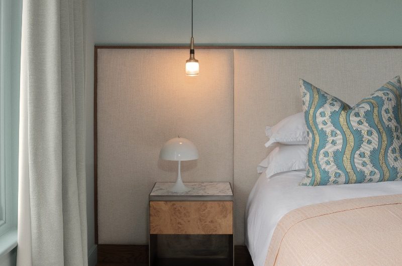
Pure shores
With Fired Earth’s new ‘Shoreline: Where Earth Meets Tide’ range, you can bring some of the British seaside charm into your home. Each of its 12 curated paint colours is named after natural elements found along Britain’s shores, telling a distinct story.
Take, for example, Sand Sedge, a soft yellow inspired by the perennial commonly growing in coastal sand dunes. Or Mermaid’s Purse, a deep olive green named after protective egg cases laid by sharks. Then, there’s the stoney, green-toned Limpet which echoes the nuanced colours of limpet shells.
“Each shade has been developed not just for its individual beauty but for how it works within our broader colour story – creating endless possibilities for layering and coordination,” says Carly Allison, head of product design at Fired Earth.

Follow the rhythm
So what if it’s all gloomy and cold outside? Inside, it’s ok to have the blues. At least that’s what Dulux’s colour of the year 2026 proves – and it’s not one, but three striking shades, aptly named Rhythm of Blues. This versatile trio of blues reflects the different paces of life, from moments of calm reflection to carefree bliss to bold fun. Introduce a sense of serenity with Mellow Flow, add a touch of familiarity with Slow Swing, and get in the groove with Free Groove.
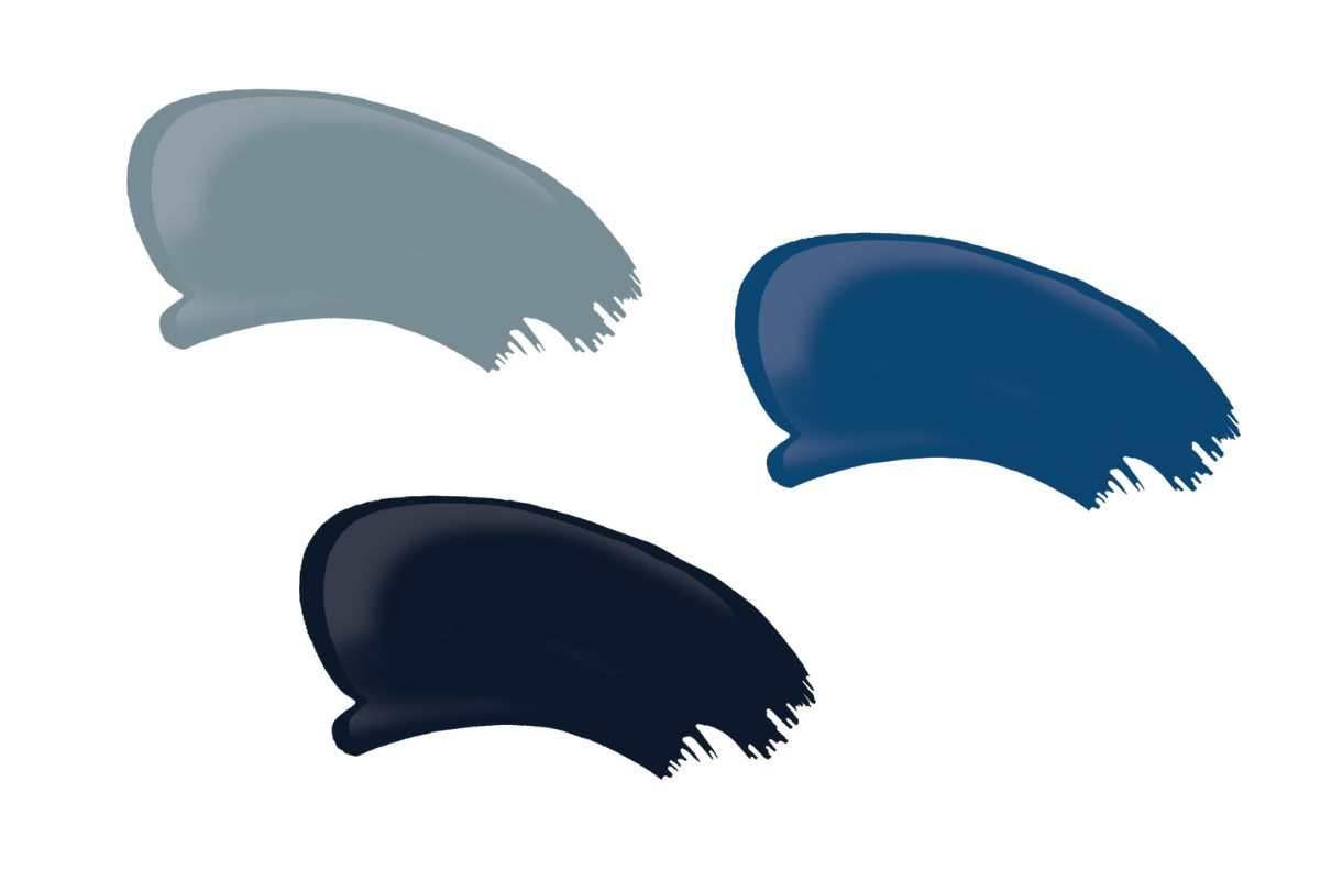
“Blue has been the world’s favourite colour for years – but it’s far from one note. It delivers a sense of fluidity, relief, stillness, and freedom,” says Marianne Shillingford, creative director and colour expert at Dulux. “When we see light blues like Mellow Flow, we might think of soothing springs or sunrise skies; or be reminded of the deep ocean’s chilled stillness with a dark blue like Slow Swing. Whereas Free Groove offers a more intense heat, like that of summer pool parties.”
Use them individually or together, with pale neutrals or bright accents, to evoke your preferred ‘tempo’. Each of the blue paints is priced from £20 for 500ml of Dulux Paint Mixing Eggshell.
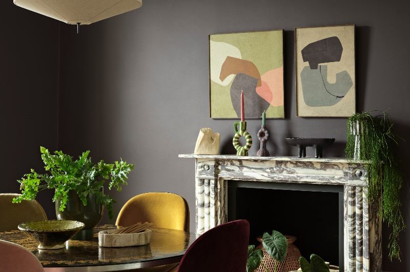
Dramatic damson
Graham & Brown has announced its design and colour of the year for 2026, both drawing inspiration from ethereal elements and natural beauty. Complementing the brand’s 2026 Design of the Year, Eternal Weave, the Colour of the Year 2026 is Divine Damson, a dark, damson shade evoking a sense of luxury and sophistication.
“Divine Damson brings a dramatic flair to any space, its subtle violet undertone adding a touch of refined elegance. Unlike the more subdued, earthy reds, this dark cherry red colour feels bold and polished, making a visual statement,” says Graham & Brown stylist and trend specialist, Paula Taylor.
Use Divine Damson as a standalone colour or combine it with muted shades such as light pastels or warm neutrals to ease the boldness. “Soft greys will balance the intensity and keep a modern look, whereas earthy neutral tones will complement the richness,” adds Paula.
Nostalgic colour palette
Who says we can’t revisit our childhood? Lick’s colour edit for 2026 takes us back to those carefree times, when joy was our only goal. ‘Return to Play’ is a palette of eight shades urging us to decorate like no one is watching. Influenced by art, fashion, music, and food, the paints – from reimagined primary colours to soothing pastels and moodier hues – encourage homeowners to get creative and personal.
“These shades take the nostalgic primaries we all grew up with and give them a refined twist – colours that feel both joyful and deeply grounding,” says Tash Bradley, director of interior design at Lick.
“Primary colours are our very first introduction to colour as children; they’re the foundations of colour theory, the simplest building blocks of creativity, and the starting point of our lifelong relationship with colour. More than a design trend, this palette represents a cultural shift: we’re moving away from decorating to impress, and instead embracing colour that makes us feel.”
From raw to refined
YesColours and J. Adams & Co’s capsule collection will take you on a journey of metamorphosis. The range traces the notions of creative transformation, from raw materials to a refined, design-led space. Each colour represents a different stage of the creative process: the strength of making, the grounding of materiality, the resilience of craft, and the tranquillity of the arrival.
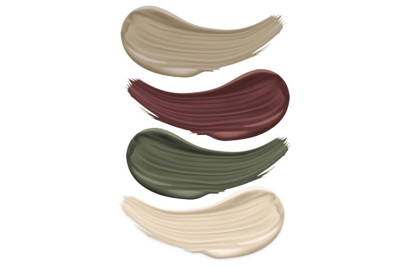
The result? A chic palette including the luminous Studio Neutral, the metal-look Patina Green, the clay-like Hockley Taupe, and the fiery Foundry Red. Each of the paints is priced £28 for one litre emulsion.
Naturally snug
If you feel you’re in a cosy, hygge mood, pick a shade that feels warm, versatile, and matches with everything. Such as Earthborn’s colour of the year 2026 – soft, earthy, and inviting, Freckle is rooted in nature, conjuring images of peaceful forests on a refreshing winter morning.
Finished in Earthborn’s signature Claypaint, it’s a naturally occurring clay colour that is free from colourants, staying true to the brand’s eco-friendly ethos. Use it to create an accent wall within a neutral palette, or pair it with bold shades for colour blocking.

Bailey Williams, colour expert at Earthborn, says: “For Scandi spaces and pared-back homes, pair the richness of Freckle with our Flutterby, a crisp, enduring neutral that offers an alternative to white, and the ever-popular Secret Room, a stunning, enveloping green. Our Nature palette is balanced and organic, which works beautifully in almost any room.”
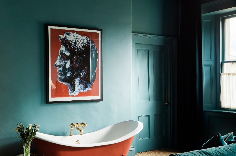
Precious gemstone colours
Trust in this unapologetic green-blue hue to bring the appeal of a rare emerald into your home. Mylands announced its 2026 colour of the year, and it’s Burlington Arcade No. 216 – a richly nuanced shade chosen for its cocooning nature and sense of balance. Originally influenced by the historic shopping arcade in central London, the colour can be a bold, bright choice within a contemporary scheme, or create depth and intimacy when paired with dark shades.
Mylands CEO Dominic Myland, says, “Burlington Arcade No. 216 is a colour that feels both reassuringly historic and modern. Whether introduced in a small area or used for a whole room, it has a transformative effect.”
Drink up!
Not ready to say goodbye to pumpkin spice latte just yet? Why not splash it on the walls then, using a Valspar paint. The brand has launched an entire, limited-edition range with tones inspired by autumn beverages, including the season’s go-to feel-good drink.
“We are seeing a huge rising trend in people opting for warmer colours, with tones like Toffee Coffee and Mocha Velvet increasing in popularity. With such a natural love for these beverage-inspired shades, it made sense to create a whole new range dedicated to the best autumnal hot drinks, of course, including Pumpkin Spice,” says Lucy Steele, paint and interiors expert at Valspar Paint.
Choose from Pumpkin Glaze, Spiced Latte, Mocha Velvet, and Almond Latte, all exclusively available at B&Q, from £30 for a 2.5 litre tin. Pair them together or with earthy hues for a super-snuggly scheme. And if you can’t find the exact tone you want, the brand will even let you photograph your drink to match it to a Valspar paint colour using its online Photo Uploader tool.
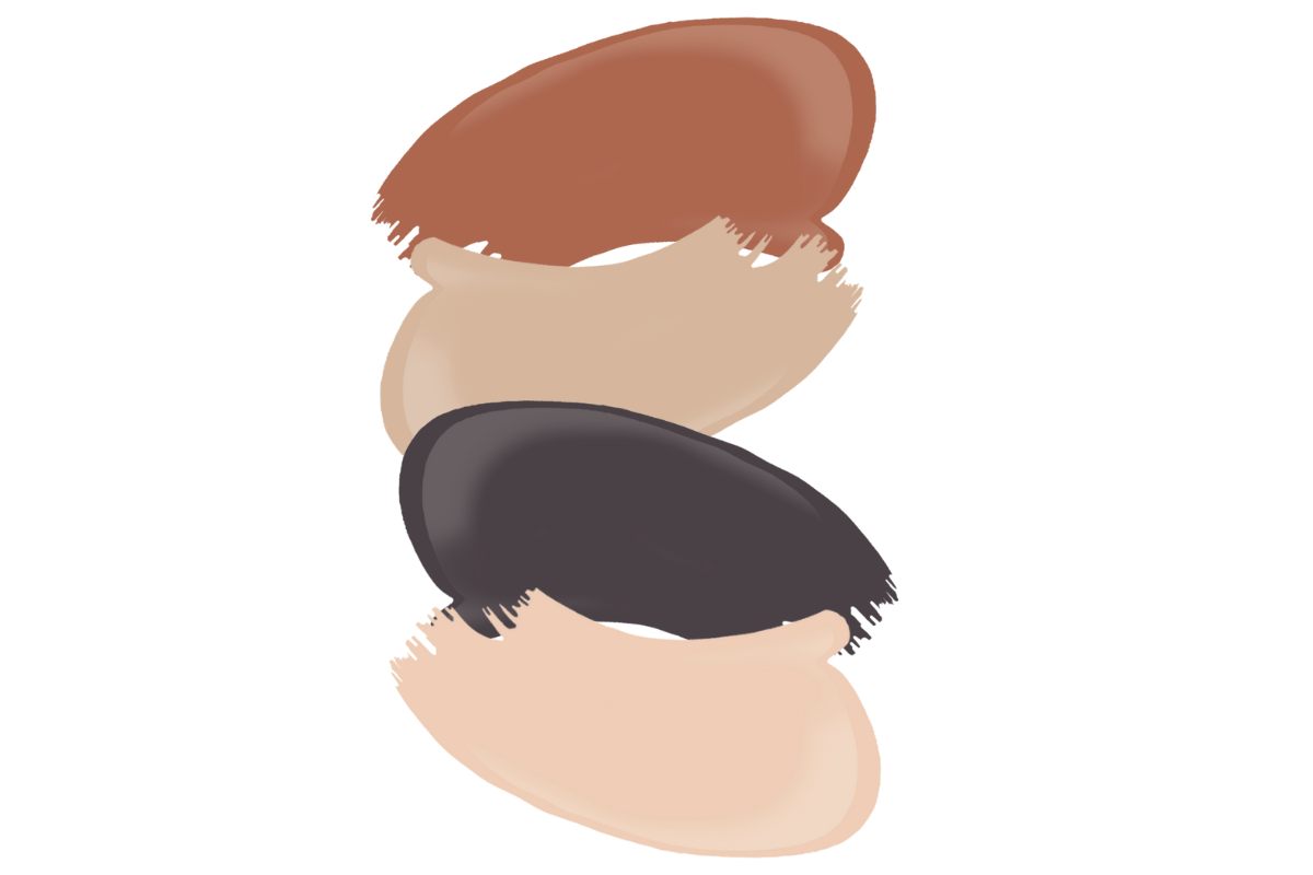
Velvety brown
This elegant, chocolatey paint colour seems perfect for the cold days ahead. Neptune’s Saddle feels like a natural evolution from the browns and mochas we were seeing this year, looking just as indulgent. Sitting between russet and brown, this rich, medium-toned hue is understated but confident, carrying a mellow warmth that ‘screams’ quiet luxury – how about using it to define a cosy reading nook by the fireplace?
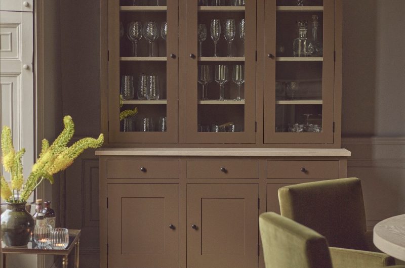
“Saddle has the richness and depth of a traditional brown, but there’s a warmth to it that makes it incredibly easy to live with,” says Fred Horlock, design director at Neptune. “We were inspired by the deep patina of aged leather, something that tells a story over time, and that’s exactly what this colour does in a home. Whether used sparingly or as a full drench, it adds character that feels comforting and enduring.”
Suit up!
Reminiscent of tailored suiting, Benjamin Moore’s Colour of the Year for 2026, Silhouette AF-655, celebrates the connection between fashion and interiors. Serving as a response to the decline of microtrends and the return to timeless style and design, the shade combines a rich espresso hue with refined notes of charcoal. Just as dapper as Saville Row tailoring, Silhouette balances comfort with an elevated aesthetic.
“There is a comfort and reassurance in classic pieces and the cornerstones of traditional design. They have staying power for a reason, and offer an opportunity to be more dynamic and innovative in the composition of a scheme. Similar to the evolution of a classic suit, we are seeing a softer, more bespoke take on these classics roll out in interior design – with nuances that are perfectly suited to contemporary styling. It’s all about the details and the attention that goes into dressing an outfit and dressing a room,” says Helen Shaw, director of marketing (international) at Benjamin Moore.
Sitting at the core of Benjamin Moore’s 2026 Colour Trends palette titled Tailored Classics, which consists of eight hues, Silhouette has the depth and alluring quality of darker chocolatey browns, with a sense of versatility and softness that nods to quiet luxury.
All about the finish
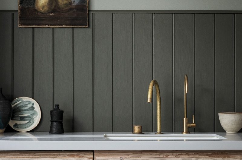
Farrow & Ball has unveiled Flat Eggshell, a durable paint finish which completes the brand’s Interior range that offers finishes for every space. Scrubbable, stain-resistant, and scuff-proof, the super-tough Flat Eggshell is ideal for interior wood, metal, and concrete. Boasting the highest scrub rating of Class 1, it brings an understated elegance to kitchen cabinets, skirting boards, and floors, while it’s the flattest interior eggshell that Farrow & Ball offers, with a 20% sheen.
“We designed Flat Eggshell with both DIYers and professionals in mind. The water-based formula is quick drying, quick curing, and has the lowest possible VOC rating, so you can enjoy your finished space even sooner,” says Gareth Hayfield, head of research and technical development at Farrow & Ball.