This couple wishes to create an open-plan kitchen-diner but need ideas on how to best maximise the space. Here, we’ve asked two designers to show them what’s possible…
Jane Fleming, retired cabin crew member, lives with her husband Will Scott, a pilot, both in their sixties, in a Grade II-listed thatched 15th-century house in West Sussex. They are planning to extend and knock through from the kitchen to a living room to create an open-plan kitchen-diner, but want ideas to make the most of the space.
So, they decided to take part in our Drawing Board feature, where interiors experts come up with creative ideas for our readers’ renovations and design dilemmas. This time, KBB journo Rachel Ogden asked head of design at Cor Domi, Matthew Andrews, and Woodmere’s interior designer Louis Vanderman, to propose kitchen styles for the couple’s period property home.
The space
The new kitchen will be extended to the side to meet the existing living room and have a ceiling height of 2.5m. This will create a space that’s approximately 9.5 x 4.2m, however, with multiple windows and entrances, wall space is limited.
The brief for the open-plan kitchen
- The couple have five adult children and one grandchild between them, who often visit. So, they would like the new kitchen to be convivial. The layout should include a breakfast bar with stools. Plus, sofa seating with a coffee table, and underfloor heating throughout.
- While the front of the property is traditional, the rear, where the kitchen sits, has been extensively renovated; it has slanting roof windows, a lead façade, and oak panels. Jane and Will plan to add a new extension with a grey aluminium lantern roof that will provide natural light. They are also reusing an original, refurbished Crittall window.
- On the wishlist are: bespoke furniture, stone worktops, good task lighting, a range cooker, American-style fridge-freezer and dishwasher, plus a large double larder.
- A freestanding log burner in the centre of the room is also a must.
Designer one
Matthew Andrews is the head of design at Cor Domi, a bespoke kitchen and joinery studio. He joined the company in January 2024 and leads its creative direction, with a focus on craftsmanship and client-centred design.

Solution one
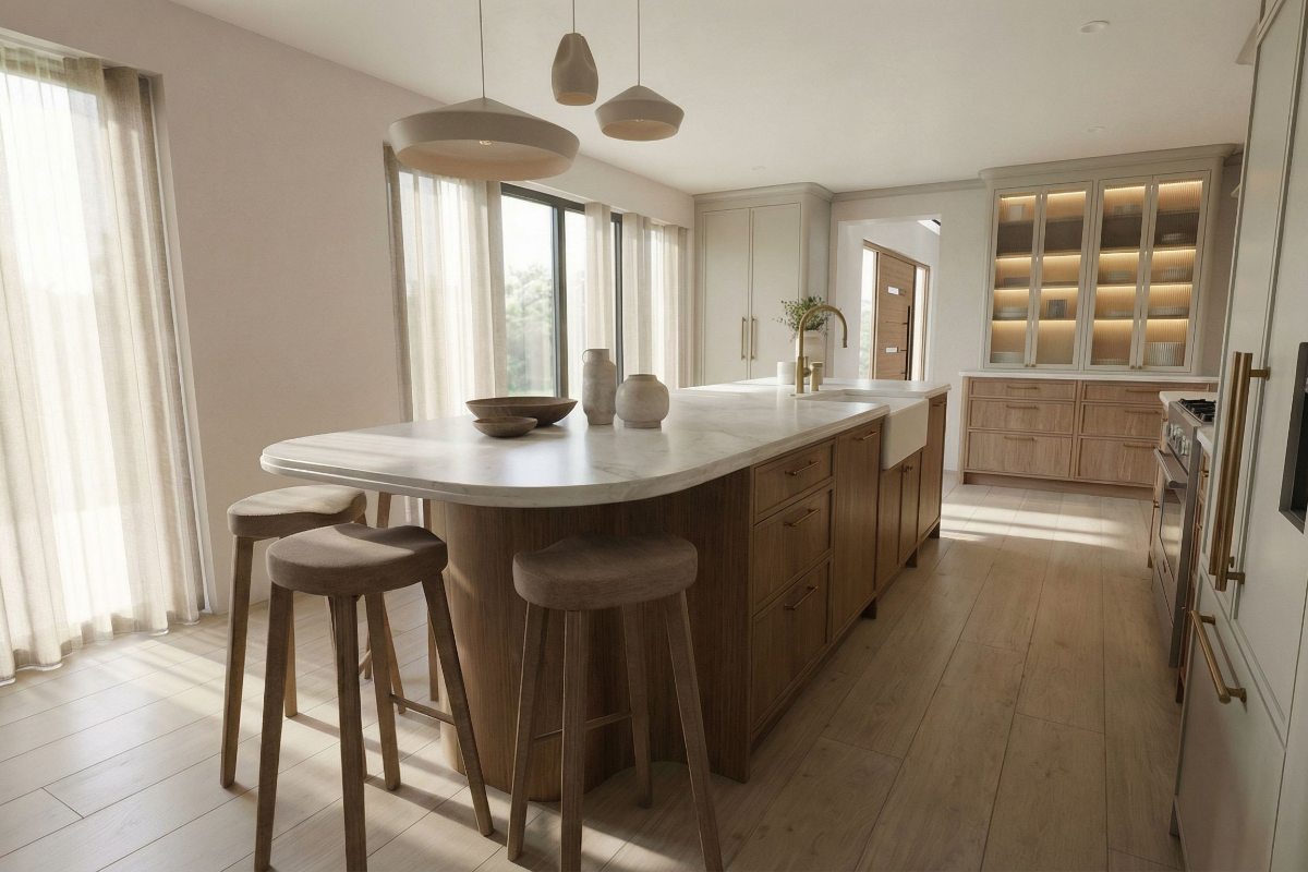
“The design for this kitchen aims to create a bright, functional, and cohesive space that sits comfortably within a Grade II-listed property, while meeting Jane and Will’s requirements for a practical, open-plan layout. I’ve focused on maximising natural light and utilising materials for a clean aesthetic, while including contemporary yet timeless finishes.”
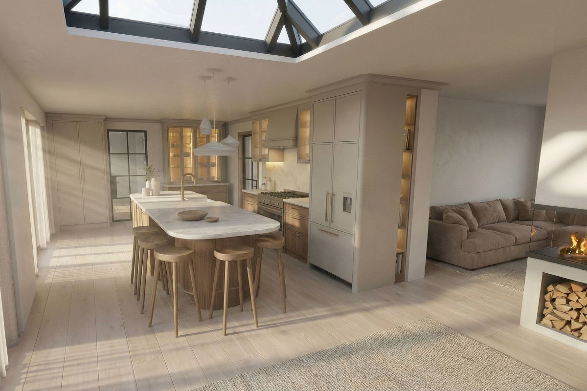
“At the centre of the scheme is a four-metre island which provides extensive preparation space. It is finished in natural oak veneer with a neutral stain. Caesarstone quartz has been used for the worktops due to its subtle veining. The island’s curved corners serve as a visual reference to the gentle lines of the property’s thatched roof, helping the new extension feel more connected to the original building. These soft curves are repeated in the bespoke shelving unit towards the hallway, the pendant lighting, and the cabinet detailing.”
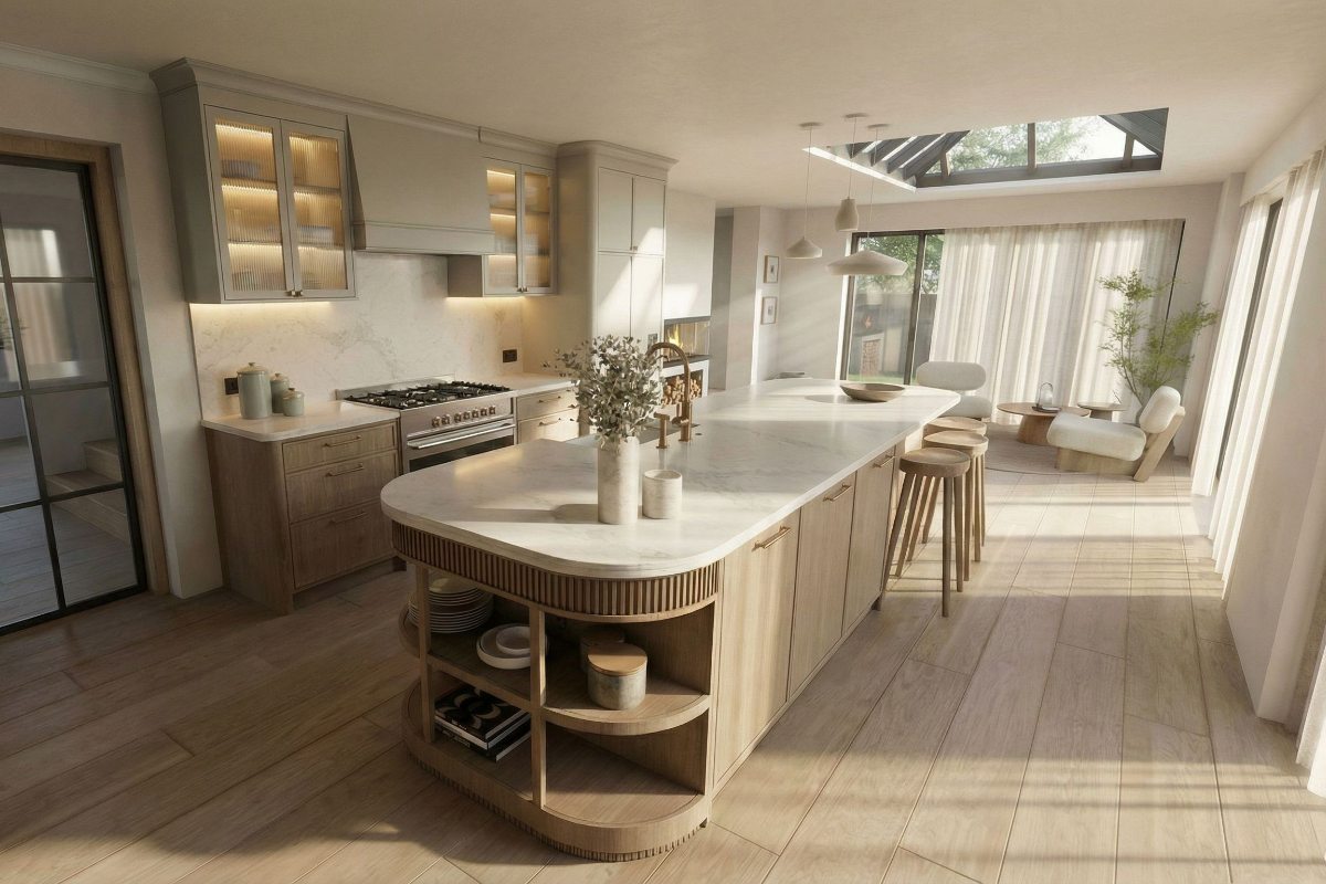
“A Fisher & Paykel range cooker was selected for its reliability and understated design. I chose the same brand for the integrated refrigeration and dishwasher, offering a streamlined appearance. A coordinating extractor prevents visual dominance, as does a simple splashback that’s a continuation of the work surface material. Bespoke cabinetry is essential given the limited wall space and the need to incorporate storage within an open-plan environment.”
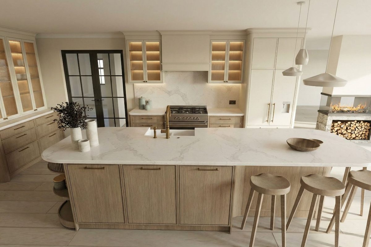
“For the perimeter cabinetry, I’ve chosen a blend of painted slim Shaker doors in Little Greene’s Rolling Fog, and oak-fronted drawers. The combination brings depth and texture while maintaining a calm feel. The couple can opt for either mesh or glass-fronted wall cabinets to introduce a lighter, semi-transparent element that aligns with the building’s traditional features without feeling heavy.
“This palette of soft greys, natural timber, brushed brass hardware, and pale quartz works seamlessly to bridge the character of the historic structure with the new extension. The result is a balanced, practical, and cohesive kitchen suited to modern living.”
Jane’s verdict
“This is our preferred design. We loved the palette and the use of natural timber; it brings warmth and works beautifully with the character of the property. The curved edges of the island help soften the look, and the concealed fridge and dishwasher are exactly what we hoped for. Turning the panel beside the fridge into slim shelving with discreet lighting is far more interesting than a plain side.
“Plus, the open shelving is another great feature. The brushed brass tap finish is something we had already been considering. So, we were pleased to see this included, too. However, while the wall unit with enclosed shelving and lighting is visually appealing, we would prefer to retain the original stone wall and exposed beams in that area. We also felt the oven might be too small – we’re hoping for a double oven configuration with a gas hob.”
Designer two
Louis Vanderman is Woodmere’s leading designer. Having spent six years with parent company Polar Build and more than 15 years in the industry, he specialises in bespoke kitchen design and joinery, residential renovations, and new-build projects.
Solution two
“Designed for a Grade II-listed thatched property, this modern kitchen elevates everyday living while respecting the building’s historic and archaeological significance. The brief focused on creating a sociable, light-filled space with functionality, all within conservation constraints. The cabinetry is finished in a soft grey satin lacquer by Woodmere. I chose this for its refined, understated aesthetic that would sit harmoniously alongside the traditional architecture.”
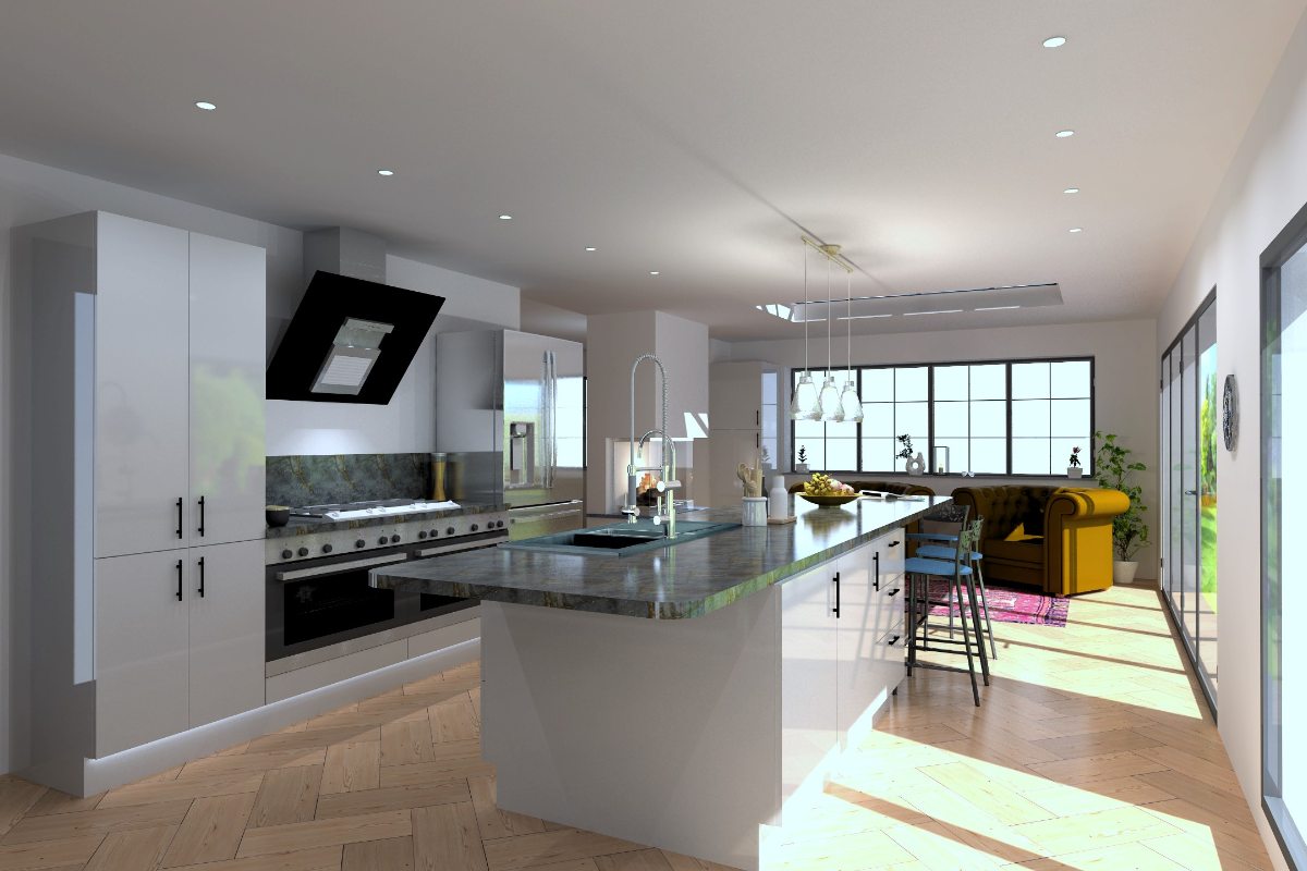
“A muted palette ensures the new kitchen complements rather than competes with original features, while the high-quality lacquer provides durability. The furniture is topped with veined quartz work surfaces, which offer visual depth and practicality. Selected for its resilience and stain resistance, the material is suited to a busy, open-plan kitchen that serves as the heart of family life.”
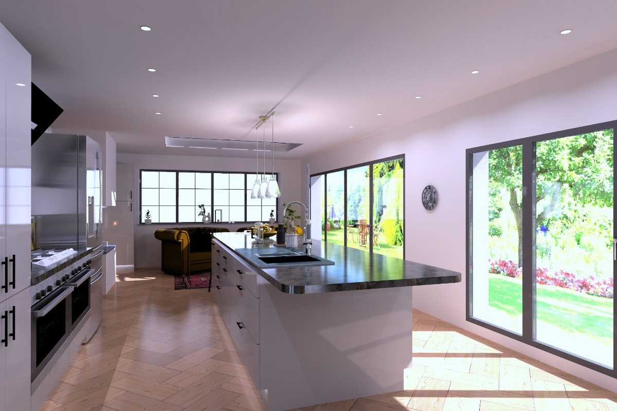
“Jane and Will were keen for their kitchen to be sociable. I’ve achieved this with a statement island that anchors the room, maximises preparation space, and promotes relaxed interaction. It features a fully integrated Miele dishwasher and a polished chrome boiling-water tap to maintain clean lines. Opposite, a professional-grade Rangemaster range cooker offers versatility for everyday meals and larger gatherings. Plus, it’s a strong visual focal point. Glazed rooflights and full-height sliding doors flood the kitchen with natural light. I’ve added functional spotlights overhead, complemented by a triple pendant light above the breakfast bar.”
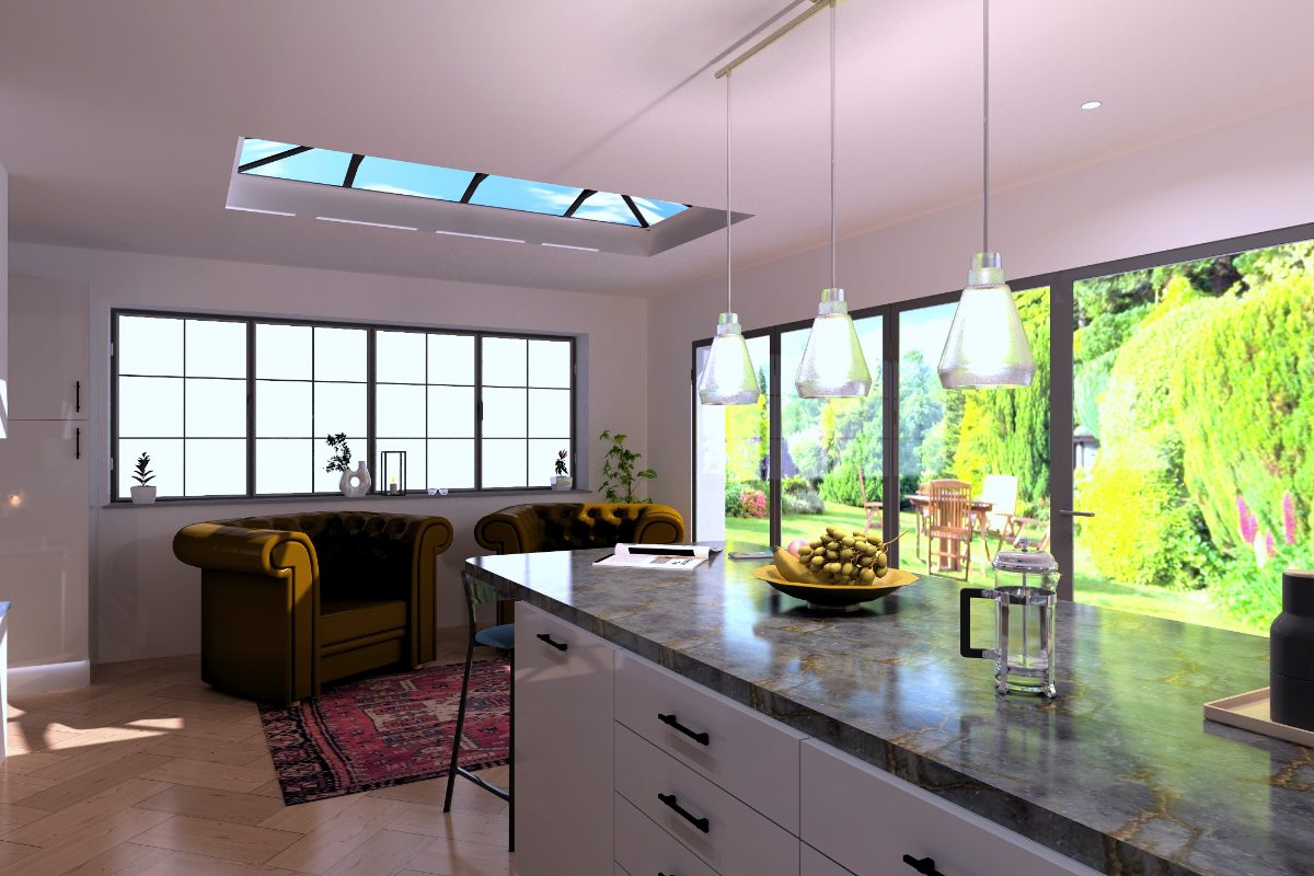
“There’s also integrated illumination within the extractor, and plinth lighting to set the mood. The scheme balances contemporary luxury with architectural sensitivity. The palette, materials, and appliances fulfil Jane and Will’s functional and aesthetic aspirations, while also respecting the building’s history. This project demonstrates how, with careful detailing and respect for context, a listed property can evolve to meet the demands of modern life without losing its integrity.”

Jane’s verdict
“This design felt less suited to our vision. While we were open to contemporary elements, the overall style leans towards a more modern look than we feel is appropriate for a 15th-century property. It has been interesting to see this design in the space, but the kitchen still needs to sit comfortably alongside the building’s original features. In addition, the colour palette felt a little flat, not bringing much warmth to the room.
“While the double ovens would provide plenty of cooking capacity, not all of the appliance selections are right. The oven hood, in particular, is similar to the one we have and plan to remove. However, it has been useful to confirm that we do want the fridge-freezer to be integrated, as we thought that it stood out too much. We did appreciate that this design adhered more closely to our budget though.”